

Since the cost and effort required to create video has been dramatically decreasing over the last few years I’ve been using it more and more to explain system architectures.
To show the impact it can have I took some time to document my hobby project - https://marketfinder.us. The way it harvests the data (pun fully intended) is interesting, and has lots of checkpoints and observation opportunities that make this type of system something I can operate solo.
An overview of the system can be seen in the harvester-architecture.md, but for this article we will focus on just the data flow. In the main doc we start with the traditional C4 view of the system and a few thousand words. Then I took that doc and gave it to Fable, which drove Remotion for the animation and ElevenLabs for the narration, and produced a five-minute animated video that explains the same pipeline. Each one took about an hour. That surprised me enough to distrust it, so this post is me pulling on the thread. An hour each is true, and it’s true for reasons we will discuss.
The system, in one breath
The thing being documented is a harvester I built for a farmers-market finder. It scrapes a market’s website, extracts structured data with Claude, geocodes the address, and stages the result for a human to review before anything touches the live directory. One line holds the shape of it: AI proposes, a human disposes, (blame Claude for that potentially sacrilegious allusion) and the disposition is measured.
Here’s the flow, one market’s data from a URL to a live row.
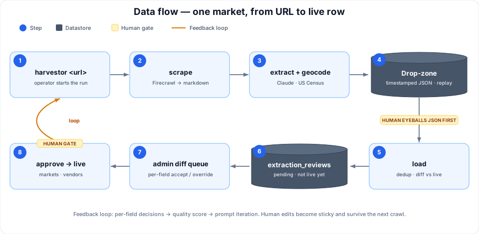
That diagram is basic, but I’ve seen much worse in plenty of revenue critical codebases. I could hand it to a new contributor with the docs and they would get by. It lives in git next to the code, and it will still be true in six months. When I finished the written version, I read it back and stopped at my own last section, where I’d written a confession: the part of this system that matters most is the part the diagram doesn’t. The structure sits still and photographs well. The behavior doesn’t. Making sequence diagrams and process flows would be the next traditional step.
What the page doesn’t do
The value of the harvester has almost nothing to do with where the boxes sit. A pipe runs left to right and forgets. This is a loop, and what makes it a loop is four mechanisms that are all motion:
- Replay. Every stage writes a git-tracked drop-zone. A bad load re-runs against the same frozen JSON, no re-scrape, no re-extract, no API spend.
- The review gate. The loader never writes live tables. It stages proposals with the matching live row snapshotted alongside, so the operator sees a true diff.
- Sticky fields. When a human overrides a field, that column is marked sticky and the next crawl drops it from the update. You can re-crawl forever and the machine never undoes a correction.
- The quality score. Every approval records a per-field decision, trended by prompt version, so you can see whether a prompt change actually moved the clean-extraction rate.
Read those back and notice what your brain has to do. The diagram freezes the loop at one instant and annotates the motion in prose, then asks you to run the animation: hold all four mechanisms in working memory at once and play them forward. Some readers will. Most will nod at the boxes and move on, and three weeks later ask why the crawler didn’t overwrite the address they fixed by hand.
If this were my day job, I’d present that doc with a voiceover explaining it and people would share the recording.
What if we could make a dynamic one that tells the story I want to tell?
The video has movement. A payload dot makes the trip out, stops dead at the human gate, crosses into the review table as pending, and only touches the live row on approval. A loader bug flashes red, the fix re-runs load alone while the expensive stages stay dark, and a counter reads $0.00. Next month’s crawl arrives and visibly bounces off a sticky field. The narration names each arrow exactly as it lights up, which is the thing prose can’t do: the word and the picture arrive at the same instant. (The costs are all made up in the video for dramatic purposes. Since I’m just testing it in Philadelphia now the cost of processing a few hundred vendors is minimal)
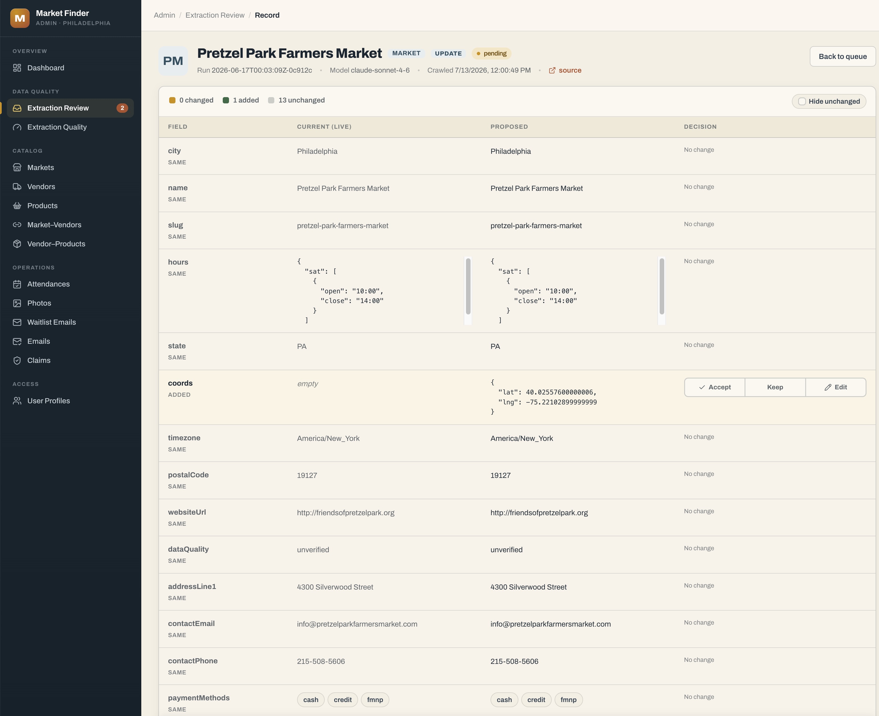
And the abstract “review gate” has a real face. This is the actual screen, one AI-proposed change to Pretzel Park Farmers Market, the geocoder adding coordinates to a field that was empty, waiting for a human to Accept, Keep, or Edit.
The hour-each is real
Now the part my contrarian agent and I distrusted. The tie holds, but only on top of a stack of prior work.
The marginal cost was a tie. About an hour each. The written doc was AI-drafted from documentation that already existed in the codebase. The video was generated from that doc and its diagrams. Neither started from a blank page, and the blank page is where the hours actually live.
The cold-start cost is nowhere near a tie. My first Remotion videos took days, not hours. If the harvester hadn’t already been documented in the code, the doc would have run past an hour too. The frameworks that made this cheap, a video pipeline and an agentic diagram pipeline, were themselves the expensive part, paid off across every piece I make now.
Full credit goes to Clief Notes, it’s my first exposure to the Skool platform and he changed the way I think about AI content creation. My current content production workflow has been months of iterating on the base pattern I learned from that community.
And there’s a polish tax the video pays that text never does. What you watched above is a good-enough explainer, not creator-grade. To make it something I’d be proud to put on a channel, I’d add an opening voiceover intro, weave in screenshots of the admin tool in use, and tighten the pacing. That’s a day or two, and I’d pay it every time, because inlining those screenshots means re-cutting the video. I deliberately didn’t pay it here. I did take some time to edit out dead space (getting the talking timing to line up is tricky and requires a little more code) and I made the title screen. That is where the hour went. The video itself was a one-shot prompt to Fable, which drove Remotion and ElevenLabs off my setup.
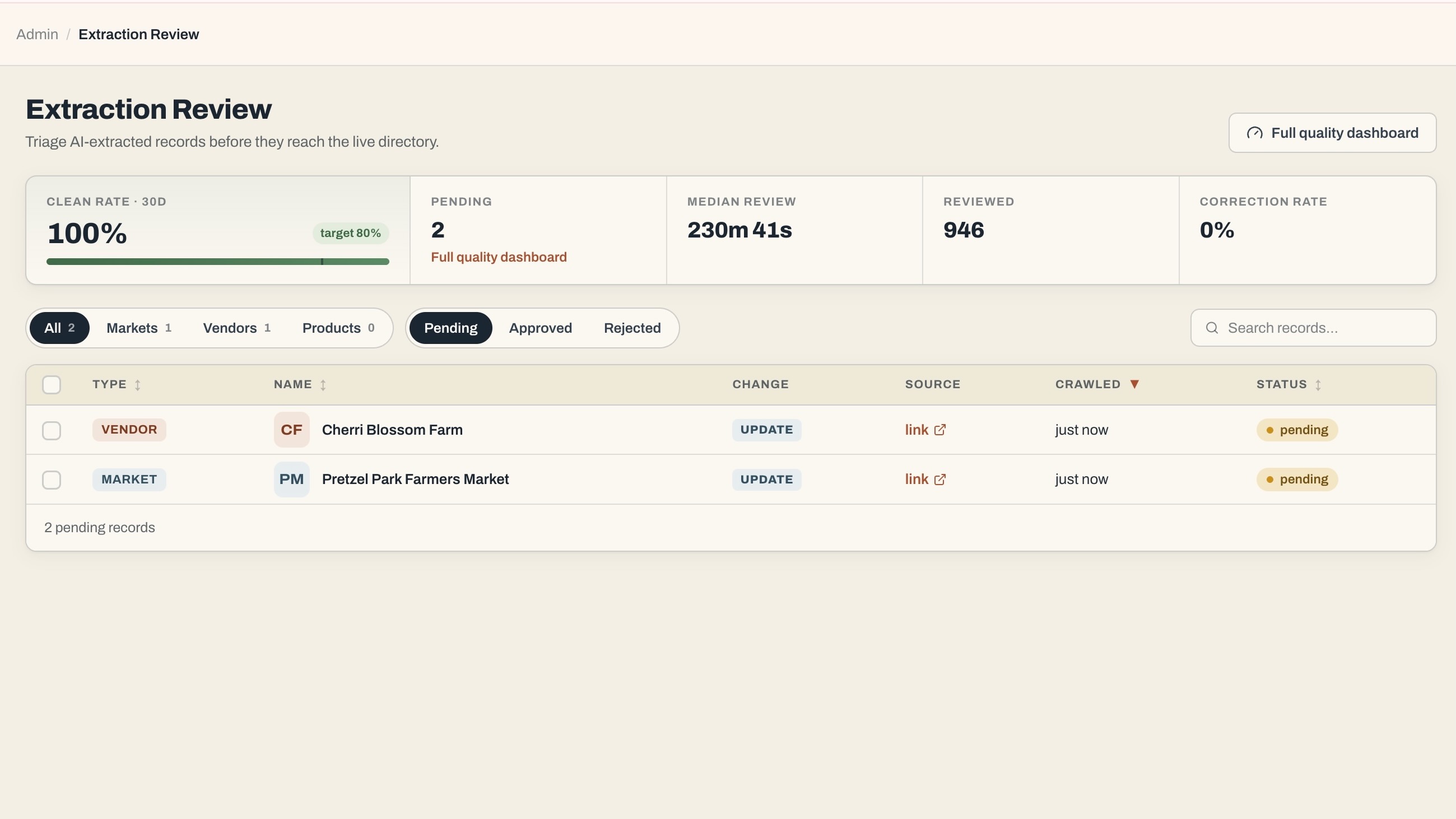
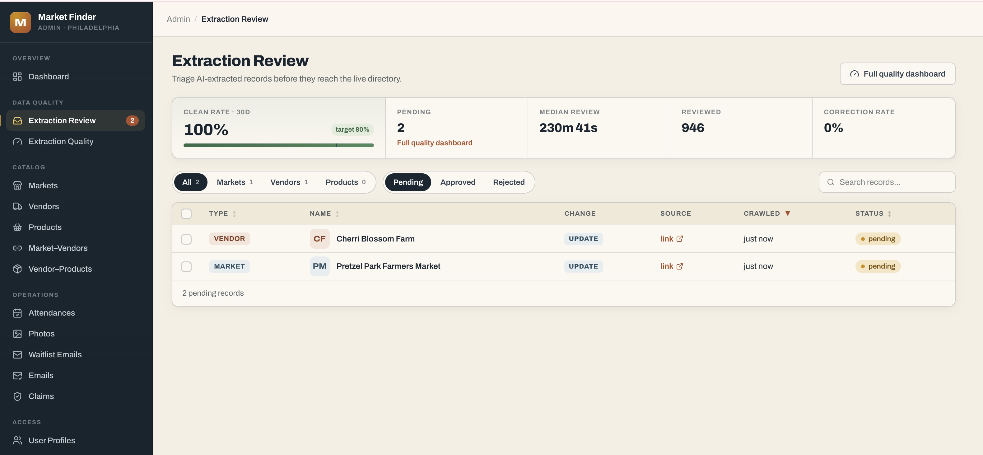
Here’s the tool the polished version would show, and the reason I’m comfortable shipping the draft without it: the review queue is legible on its own.
Did the motion teach, or did I just enjoy making it
I have to be honest about who’s grading this. I built both artifacts, and the maker is the worst possible judge of an explanation, because he supplies the missing understanding without noticing. The video also came second, and the second telling of anything is clearer than the first whether or not it moves. Making videos on Youtube is way more rewarding than adding a page to a wiki.
The research agrees I should be careful. Barbara Tversky’s review of a decade of animation studies found that when a static graphic and an animation carry the same information, the animation often fails to win, because motion is transient: it plays at the animator’s pace, and the viewer loses the control a page gives them to dwell, re-inspect, and compare two regions side by side.1 That critique is exactly why the video ends on a recap frame built to be paused, ships with chapter markers, and links the written doc as the companion you read when you want to stop and stare. Richard Mayer’s multimedia work points the other way: narration synchronized with the matching visual engages two channels at once, which is the harvester video’s whole trick.2
So I’ll concede the strongest objection outright. The written doc stays canonical. It’s diffable, greppable, reviewable in a pull request, and versioned next to the code. The video is none of those, and it starts going stale the day it renders. It is not documentation of record and never will be.
What the video has that the doc doesn’t is attention. A complete C4 document that a reader abandons at section two has taught nothing, however correct it is. If the animation’s real advantage is that people watch it to the end, then effectiveness includes who shows up, and that’s a field result the lab studies weren’t measuring.
Where they are worth the effort
I am thinking that video is right given some conditions on the system and audience:
- The essential system behavior is dynamic, a loop or a protocol or a failure cascade, not a layout. If the hard part is where things are, the diagram already wins.
- The pipeline is already amortized. If your first video would take days, the honest cost isn’t an hour.
- The audience is wide or recurring, every new hire or a public channel, enough to justify the polish tax a one-time handoff never would.
- The system is stable enough to outlive the render, so the thing you paid to polish doesn’t lie within the month.
Miss any of those and the answer is to write the diagram, keep it in git, and spend the video budget on nothing.
I’ll keep writing the diagram first, every time. Partly from habit but mostly because docs have always been non-negotiable to me. It’s where the thinking happens, and it’s the only version I trust to stay true as the code moves under it. The video is what I make once the diagram is done and I can see people’s eyes slide off the part that matters, the part that moves. I’ll keep refining this and eventually get to the video being just another step in our CI/CD process, right along with API docs and Storybook.
Go look at the last architecture doc you shipped. Does anything in it change state over time? If it does, every reader is animating that loop in their head right now, each one a little differently, and you’re the only one who can run it for them once, correctly.
Comment on LinkedIn and let me know if you are going to adopt video for documentation.
Related posts: The Island of Misfit Toys on how this video workflow got built, and Streamlining Blog Writing with Claude Code on the pipeline that produced this article. The full written architecture doc with C4, generated from the research agent based on the harvester codebase is here if you are curious.